An analysis of age group performance, cross-distance patterns, and gender differences at Mallorca 312 (2025)
A bit of context (and mild embarrassment)
Last April I rode the Mallorca 312, 312 kilometres across the mountains of Mallorca, an event that attracts some of the strongest amateur cyclists in Europe. I am in my early 30s, which according to the data I am about to present should put me somewhere near the peak of human endurance performance. The 30-39 age group is, in this dataset, the fastest decade bracket after the tiny U20 cohort. Physiologically, I should be in my prime.
I finished in 13 hours.
To be precise, 13 hours puts me at the 61st percentile of my age group, meaning 39% of my fellow 30-somethings beat me. More entertainingly, my average speed of 24.0 km/h is slower than the average 50-59 male finisher (24.75 km/h) and nearly identical to the average 60-69 male (24.60 km/h). Statistically, I rode like the average 65-year-old which I hope says more about the remarkable fitness of older endurance athletes than it does about me.
I am now in the final stages of preparation for the 2026 edition, where I am targeting 11 hours. That would put me in the top 20% of my age group and at a speed of 28.4 km/h, meaningfully above the group average of 25.4 km/h. Whether my legs cooperate is a different question. But in the meantime, I spent some time digging into the full results dataset to understand what age actually does to performance in events like this, because the official age group structure raises some questions that the data can helpfully answer.
Introduction
Most endurance events sort participants into decade-wide age groups: 20-29, 30-39, 40-49, and so on. It is a clean and administratively simple system. But is it actually the right one? And do performance differences between groups justify the boundaries we draw?
Mallorca 312 (2025) offers a rare dataset to examine this from multiple angles: three race distances (167 km, 225 km, and 312 km), a total of 7,781 finishers, and full birthdate and gender data for each participant. The analysis below looks at age group performance across all three distances, how those patterns compare when pooled, and what happens when you split men and women within each group.
The key question is simple: do 10-year age groups reflect real performance breaks or are some boundaries essentially arbitrary? The data suggests that only one decade boundary consistently holds up to scrutiny: 50.
The three distances
Before comparing age groups, it is worth noting something counterintuitive in the raw speeds:
| Distance | Total finishers | Avg speed (all ages, male) |
|---|---|---|
| 167 km | 4,172 | ~22.1 km/h |
| 225 km | 1,972 | ~22.6 km/h |
| 312 km | 2,633 | ~25.4 km/h |
The 312 km riders are on average *faster* than those doing 167 km. This is selection at work: the longest distance draws a self-selected group of experienced, highly trained athletes, while the 167 km is more accessible with a broader and more varied field.
It is important to distinguish two different kinds of speed differences in this dataset. The cross-race differences above are driven by self-selection who chooses to attempt 312 km and say nothing about how age affects performance. The within-race age group differences that follow are fundamentally different, they reflect performance gaps among athletes who have all committed to the same distance and the same day. Those within-race patterns are the meaningful signal, and as we’ll see, they are remarkably consistent across all three distances.
Age group performance across the three distances
167 km
| Age Group | Finishers | M avg speed km/h | F avg speed km/h | M avg time | F avg time |
|---|---|---|---|---|---|
| U20 | 29 | 26.41 | 21.26 | 6h34m | 7h51m |
| 20-29 | 220 | 23.44 | 21.82 | 7h21m | 7h45m |
| 30-39 | 611 | 22.88 | 20.84 | 7h30m | 8h09m |
| 40-49 | 930 | 22.33 | 20.19 | 7h38m | 8h23m |
| 50-59 | 960 | 21.50 | 19.67 | 7h53m | 8h36m |
| 60-69 | 374 | 21.08 | 19.46 | 8h02m | 8h40m |
| 70+ | 49 | 20.68 | 20.05 | 8h09m | 8h19m |
The 167 km shows the smoothest and most linear decline of the three races. Each decade drops by roughly 0.5-0.8 km/h for men. The field is large enough, nearly 1000 in each of the 40-49 and 50-59 groups. That averages are statistically solid.
225 km
| Age Group | Finishers | M avg speed km/h | F avg speed km/h | M avg time | F avg time |
|---|---|---|---|---|---|
| U20 | 12 | 22.88 | 19.08 | 9h53m | 11h47m |
| 20-29 | 119 | 23.16 | 22.08 | 9h53m | 10h17m |
| 30-39 | 430 | 23.25 | 21.88 | 9h51m | 10h22m |
| 40-49 | 598 | 22.57 | 21.62 | 10h06m | 10h32m |
| 50-59 | 613 | 22.14 | 21.01 | 10h16m | 10h46m |
| 60-69 | 190 | 21.69 | 22.62* | 10h27m | 10h02m* |
| 70+ | 10 | 21.09 | 24.01* | 10h40m | 9h22m* |
*Very small female sample (16 women in 60-69, 1 woman in 70+). These figures reflect survivor/selection bias, not a genuine performance reversal (see the gender section).
The 225 km shows an interesting compression in the 20-39 range: male speeds for those age groups are nearly identical (23.16 vs 23.25 km/h). The slight “reversal”, 30-somethings marginally faster than 20-somethings. It is well within normal variation given the group sizes, and reinforces that these two cohorts are in the same performance tier.
312 km
| Age Group | Finishers | M avg speed km/h | F avg speed km/h | M avg time | F avg time |
|---|---|---|---|---|---|
| U20 | 10 | 26.75 | – | 11h44m | – |
| 20-29 | 205 | 25.90 | 24.54 | 12h11m | 12h47m |
| 30-39 | 651 | 25.70 | 24.57 | 12h17m | 12h46m |
| 40-49 | 869 | 25.61 | 24.60 | 12h19m | 12h47m |
| 50-59 | 730 | 24.75 | 23.29 | 12h42m | 13h25m |
| 60-69 | 163 | 24.60 | 22.70 | 12h45m | 13h44m |
| 70+ | 4 | 25.92 | – | 12h14m | – |
The 312 km dataset makes the strongest case for rethinking decade bands. The male 20-29, 30-39, and 40-49 groups are separated by just 0.20 and 0.09 km/h respectively. The entire span from age 20 to 49 covers only 0.29 km/h. Then the 50s arrive and cut 0.86 km/h in a single step. The drop entering the 50s is nearly 10 times larger than the drop entering the 40s. This ratio, not just the direction, is what makes the 50-year boundary clearly different from the others.
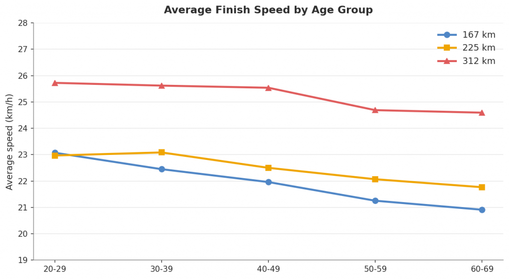
Cross-race comparison: Does the pattern hold?
Looking at male average speed across all three distances side by side:
| Age Group | 167km (M) | 225km (M) | 312km (M) | 167km (F) | 225km (F) | 312km (F) |
|---|---|---|---|---|---|---|
| 20-29 | 23.44 | 23.16 | 25.90 | 21.82 | 22.08 | 24.54 |
| 30-39 | 22.88 | 23.25 | 25.70 | 20.84 | 21.88 | 24.57 |
| 40-49 | 22.33 | 22.57 | 25.61 | 20.19 | 21.62 | 24.60 |
| 50-59 | 21.50 | 22.14 | 24.75 | 19.67 | 21.01 | 23.29 |
| 60-69 | 21.08 | 21.69 | 24.60 | 19.46 | 22.62* | 22.70 |
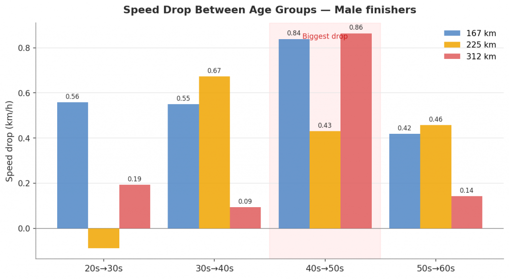
Two things are consistent at every distance:
1. The 30-39 to 40-49 transition is small. No distance shows a male speed drop larger than 0.68 km/h between these decades. In the 225 km it reverses by 0.09 km/h.
2. The 40-49 to 50-59 transition is the largest single step in every race. At 167 km: -0.83 km/h. At 225 km: -0.43 km/h. At 312 km: -0.86 km/h.
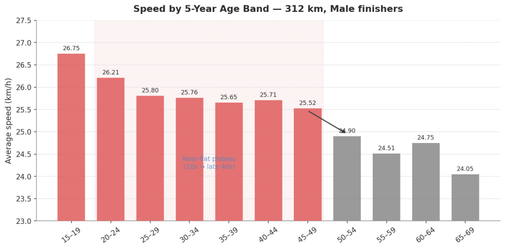
Zooming in: 5-year buckets
Decade groupings hide variation within each bracket. Splitting 312 km male finishers into 5-year bands reveals the full picture:
| 5-Year Band | Finishers | Avg speed |
|---|---|---|
| 20-24 | 44 | 26.04 km/h |
| 25-29 | 161 | 25.64 km/h |
| 30-34 | 312 | 25.66 km/h |
| 35-39 | 339 | 25.58 km/h |
| 40-44 | 414 | 25.61 km/h |
| 45-49 | 455 | 25.47 km/h |
| 50-54 | 446 | 24.82 km/h |
| 55-59 | 284 | 24.49 km/h |
| 60-64 | 130 | 24.73 km/h |
| 65-69 | 33 | 24.05 km/h |
From age 30 to 49, a 20-year window, average speed falls by just 0.19 km/h. These athletes are for all practical purposes in the same performance band. What this table makes explicit is that the true performance curve here is not a steady linear decline. It is a plateau followed by a step-change. That distinction matters because a steady decline would support evenly-spaced decade bands; a plateau then a cliff does not. In practical terms, your 49-year-old rival is probably still racing you. Your 51-year-old self might not be.
The within-decade spread also grows with age in a way that is measurably larger. The gap between the first and second half of each decade, the difference between the 30-34 and 35-39 bands, or between 50-54 and 55-59, widens from 0.08 km/h in the 30s to 0.33 km/h in the 50s, a four-fold increase. A 50-year-old and a 59-year-old are not in the same competitive bracket; this quantifies by how much.
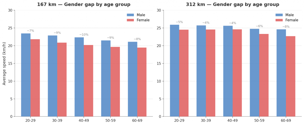
Gender differences across age groups
The consistent gap
Pooling all finishers across all three races, the average speed gap between male and female athletes is:
| Age Group | M avg speed | F avg speed | Gap (km/h) | Women slower by |
|---|---|---|---|---|
| 20-29 | 24.36 | 22.60 | 1.76 | 7.2% |
| 30-39 | 24.14 | 21.86 | 2.28 | 9.5% |
| 40-49 | 23.64 | 21.45 | 2.19 | 9.3% |
| 50-59 | 22.75 | 20.48 | 2.27 | 10.0% |
| 60-69 | 22.09 | 20.44 | 1.65 | 7.5% |
The gender gap is remarkably stable across age groups, hovering between 7% and 10% throughout. This is consistent with the 8-12% gap typically observed in trained endurance populations across marathon and long-course triathlon, and it tracks the expectation from exercise physiology: the aerobic capacity difference between trained men and women is relatively constant and does not widen or narrow meaningfully with age among serious competitors. The gap neither widens (as would be expected if women declined faster) nor narrows clearly (as selection effects might suggest), it is broadly flat from the 20s through the 60s.
The data limitation
Any gender analysis of this dataset comes with an important caveat: women are dramatically underrepresented, particularly at longer distances.
| Distance | Male finishers | Female finishers | Female % |
|---|---|---|---|
| 167 km | ~3,500 | ~650 | ~15.6% |
| 225 km | ~1,800 | ~177 | ~9.0% |
| 312 km | 2,466 | 166 | 6.3% |
In the 312 km, 166 women finished. Split across seven age groups, several cells have fewer than 30 individuals. The 60-69 group has a single female finisher. These sample sizes are not a basis for confident conclusions, which is why some figures, particularly for older age groups at longer distances, should be read as illustrative rather than reliable estimates. The anomalies in the 225 km 60-69 and 70+ female data (where women appear faster than men) are almost certainly selection effects: the handful of women who complete 225 km in their 60s or 70s are almost by definition exceptional athletes.
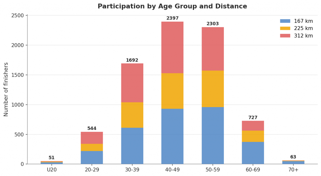
Who is actually racing
Participation numbers matter for where we invest precision in age group design:
| Age Group | 167km | 225km | 312km | Total | % of all finishers |
|---|---|---|---|---|---|
| U20 | 29 | 12 | 10 | 51 | 0.7% |
| 20-29 | 220 | 119 | 205 | 544 | 7.0% |
| 30-39 | 611 | 430 | 651 | 1,692 | 21.8% |
| 40-49 | 930 | 598 | 869 | 2,397 | 30.8% |
| 50-59 | 960 | 613 | 730 | 2,303 | 29.6% |
| 60-69 | 374 | 190 | 163 | 727 | 9.3% |
| 70+ | 49 | 10 | 4 | 63 | 0.8% |
Nearly two-thirds of all finishers are aged 40-59. Add the 30s and you account for more than 80% of the entire field. U20 and 70+ together are just 1.5% of participants.
The implication is direct: the categories that matter most for competitive fairness are the ones covering the 35-65 range. This is precisely where most age group racing happens, and it is also where the data shows the most need for precision, particularly around the 50-year threshold.
Where I fit in (and where I’m aiming)
To make the abstract concrete, here is the finish time distribution for 30-39 male finishers at the 312 km, with my 2025 result and my 2026 goal marked.
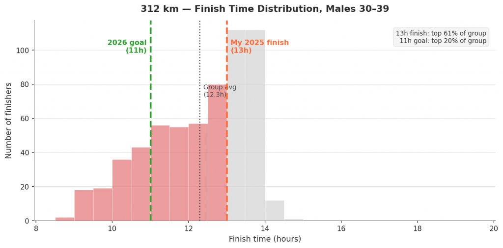
A 13-hour finish sits at the 61st percentile of the group, not last, but comfortably in the wrong half. The group average is 12h17m. My 13h finish corresponds to 24.0 km/h, which is below the average for the 50-59 group. The 11-hour target corresponds to 28.4 km/h and would put me in the top 20% of my age group.
That is a significant gap to close. But understanding where the field actually is, and that my age group is genuinely one of the most competitive, at least gives a clear target to aim at.
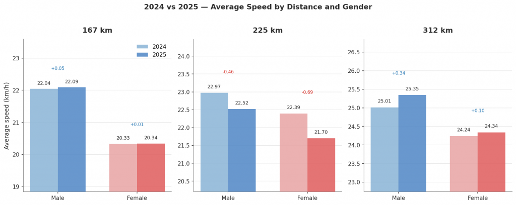
Year-on-year stability: 2024 vs 2025
One year of race data could always be an anomaly, an unusual field, atypical weather, or some other confound. The 2024 edition results across all three distances allow a direct check: do the overall patterns hold from one year to the next?
The 2024 data has one important limitation: it does not include age group. Age group comparison across years is therefore not possible. What can be compared is overall field speed, gender split, and participation numbers – and that comparison is instructive.
| Distance | Finishers 2024 | Finishers 2025 | M avg speed 2024 km/h | M avg speed 2025 km/h | F avg speed 2024 km/h | F avg speed 2025 km/h |
|---|---|---|---|---|---|---|
| 167 km | 3,291 | 3,175 | 22.04 | 22.09 | 20.33 | 20.34 |
| 225 km | 1,358 | 1,973 | 22.97 | 22.52 | 22.39 | 21.70 |
| 312 km | 2,475 | 2,633 | 25.01 | 25.35 | 24.24 | 24.34 |
The 167 km and 312 km numbers are striking in their consistency. Average male speed at the 167 km differs by just 0.05 km/h between years, effectively zero. At the 312 km, the year-on-year shift is 0.34 km/h (about 1.3%), well within what weather, course conditions, or a slightly different field mix would explain. Female averages are similarly stable.
The 225 km shows a larger speed drop in 2025 (-0.45 km/h for men), which aligns with the field growing by 45% (1,358 → 1,973 finishers). A significantly larger entry base brings in more recreational-pace athletes, so the lower average reflects a broader, more inclusive field rather than a change in conditions.
Gender participation trend is also visible:
| Distance | Female % 2024 | Female % 2025 | Change |
|---|---|---|---|
| 167 km | 15.8% | 16.2% | +0.4pp |
| 225 km | 8.8% | 9.0% | +0.2pp |
| 312 km | 4.6% | 6.3% | +1.7pp |
The increase at the 312 km is the most notable, from 114 to 166 female finishers, a 46% increase in absolute numbers, at the distance where the female sample was thinnest.
The stability of average speeds across two editions means the 2025 age group patterns are unlikely to be artefacts of an unusual year. Without birthdates in the 2024 data it is not possible to verify whether the age group distributions were similar across years, that remains a gap. If future editions retain birthdate data, a proper longitudinal age group analysis becomes feasible. For now, the year-on-year check at the aggregate level is enough to treat the 2025 findings as reflecting a stable, reproducible population rather than a one-off result.
The case for narrower bands where it counts
Combining performance data and participation figures, the argument for revising standard 10-year groupings becomes clear.
Where 10-year bands overfit: The 20-29 to 30-39 transition shows minimal performance decline at every distance. Separating these into two categories creates competitive divisions without strong physiological justification.
Where 10-year bands are about right: The 30-39 to 40-49 drop is small but detectable, most visible in the 167 km (-0.55 km/h) where sample sizes are largest. A separate 40-49 category is defensible, though barely.
Where 10-year bands are too coarse: From 50 onwards. A 50-year-old and a 59-year-old are not in the same competitive bracket, and the data makes this difficult to ignore. The within-decade spread in the 50s is four times larger than in the 30s. The same logic applies to 60-69, where 727 finishers across the three distances provide a solid basis for finer categories.
A grouping structure more consistent with the data might look like:
Under 35: low participation, high variance, no urgency
35-44: performance is essentially uniform here
45-54: the transition zone; this is the highest-impact boundary to get right
55-64: the mid-senior tier, well-populated and with clear performance differences
65+: or 65-69 / 70+ if numbers allow
This mirrors what many major marathon and gran fondo events already do. The data from Mallorca 312 provides an empirical basis for making the same adjustment in endurance cycling.
Conclusion
Across 7,781 finishers at three distances, the same pattern repeats: the decade boundaries at 30, 40, and 50 are not equal in their significance. The 30-to-40 transition barely registers in the numbers. The 40-to-50 transition is modest. The 50-to-60 transition is the sharpest inflection in the data by a clear margin, at the 312 km, nearly ten times larger than the preceding step, and it appears at every race distance.
The gender gap, around 8-10% for women across prime age groups, is consistent and stable with age, matching what the endurance sports literature generally finds, though female participation at longer distances is too thin for confident subcategory analysis.
If Mallorca 312 were designing age groups from scratch using only empirical performance data, 50 would be the first boundary drawn. Everything else follows from that. Finer resolution in the 50s and 60s, where most of the competitive action happens and where within-decade spread is four times larger than in the 30s, would make categories meaningfully fairer without adding administrative complexity.
As for me, I will be lining up in 2026 with the goal of no longer finishing at the average pace of a 65-year-old. The data suggests my age group should be capable of considerably better. Whether I am is a question for late April.
*Data source: Mallorca 312 official race results, 2025 edition (167 km, 225 km, and 312 km) and 2024 edition for year-on-year validation. Analysis covers all athletes classified as “finished” with a valid META split time and age group data. Total analysed: 7,777 finishers (4 excluded due to missing age group). Charts generated from raw result data using Python/matplotlib.
Image by Mariya Muschard from Pixabay
Leave a Reply